- cross-posted to:
- hackernews@derp.foo
- cross-posted to:
- hackernews@derp.foo
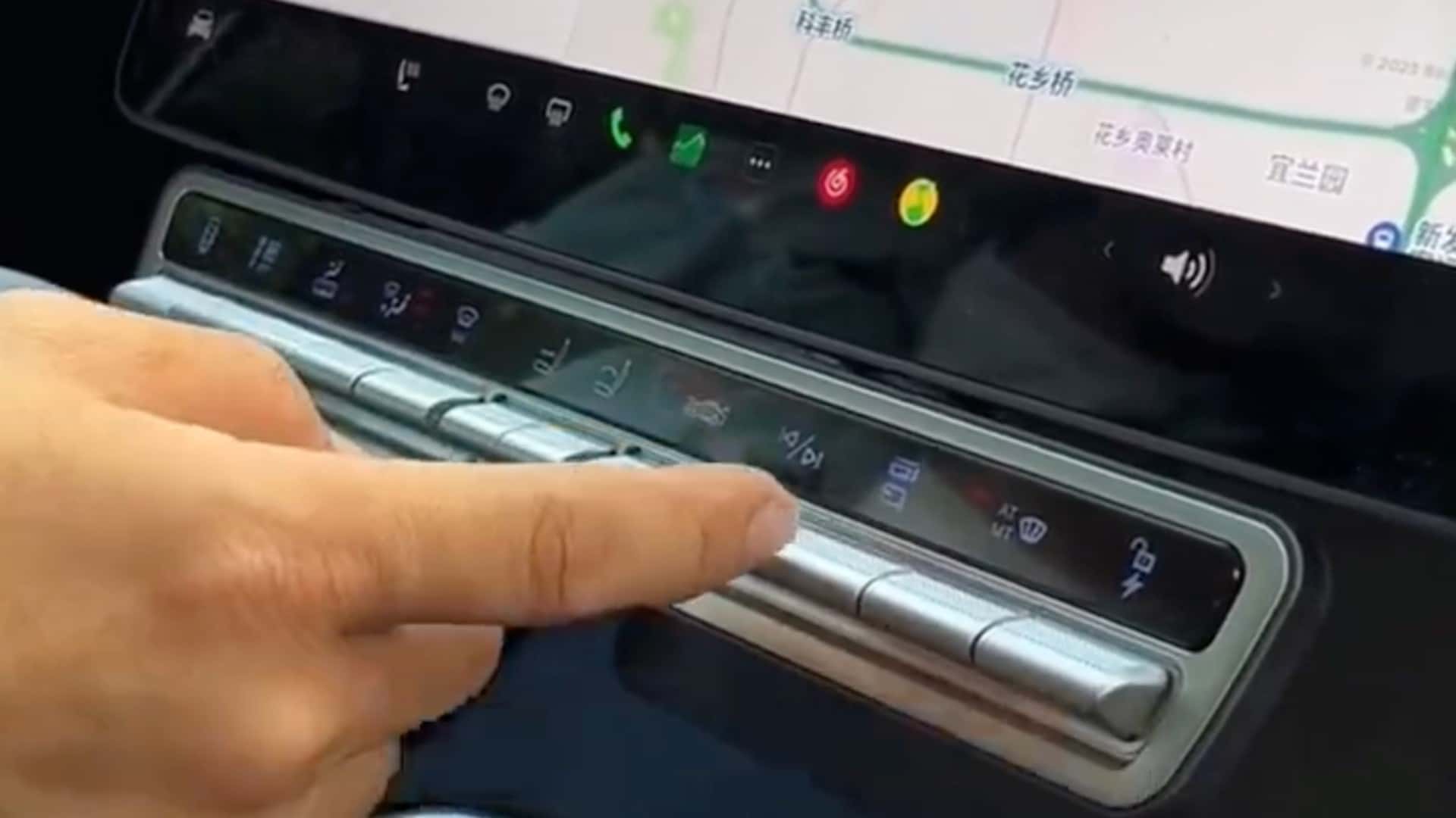
Tesla Model X Owner Has Had Enough Of Minimalism, Adds Physical Buttons::Tesla Model X owner from China has attached a panel of physical buttons to the vehicle’s main control unit for quicker access to some key functions.


Simce when is a giant computer screen glaring in your face considered minimalism? I would argue the buttons return the car to proper minimalism. So glad to see this! Can we just yank all of those screens out of future vehicles?
I dont think removing the screen complete is the right way around this. Having something that can display maps and more information is good. But it should have never become the only thing.
You need buttons and easy access to functions that are always available in easy to remember places. So that you aren’t spending attention away from the road when you want to change the fan control.
Fuck this bullshit touchscreen only nonsense, actual physical buttons are superior in a car.
As somone that lives in a dark sky rural area, the computer screen totally distracts and prevents your eyes from seeing the road where there are no streetlights. It is like driving with someone pointing a flashlight in your eyes that you can’t turn down.
Agreed. The screen should be an OLED so the blacks are actually off, and overall dim solely using easier colors at night, low intensity red hues are proven in Astronomy to not screw with your vision, for instance.
One of the first things I changed on my TLX when I got it was getting rid of the “blue everything” setting on the screens and going with a red interface and it made a world of difference.
It also does that in teslas, it automatically goes in to “dark mode” so it’s not a large white screen, reduces blue light and dims backlight on the screen when it’s dark outside.
Night mode works great for me. But I use an amoled screen. Maybe a regular screen with adjustable brightness and night mode might work.
Physical buttons are better for everything that you want to be able to control without looking at
Personally I think a good tactile display could fix this but I would prefer a voice control that really works more than any buttons. I’ve heard Teslas voice control is pretty good, but I have yet to be satisfied with any automobile voice control.
This aesthetic minimalism and there’s minimalism as lifestyle philosophy. Those two are not related and often contradict each other.