

Arctic is a (much) better Lemmy client than any other out there for iOS at least but there are some nifty features for the most recommended app Voyager like the ability to disable side swipes altogether because Apollo’s (reddit) double-tap to upvote for example is much intuitive where side swipes are used to enter and exit communities, posts, comments, menus, settings… or whole app together on Android or Jailbroken devices.
This is my multireddit link after removing u/user which were included as r/_u/redditor from an existing bug to test this for Arctic which would fully enable me along with a lot of us to leave Voyager behind.
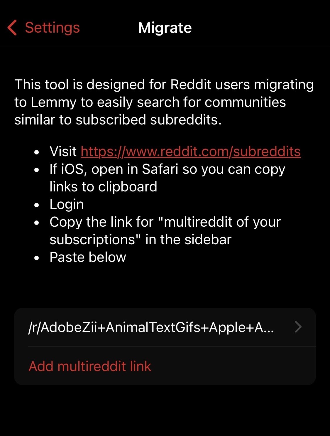
I’ve finished up the reddit migrator for Arctic. This will behave exactly like the migrator in Voyager. Voyager did this vey well and I did not see much room for improvement. I made sure to give credit to Voyager for the feature idea.
I did experiment with loading reddit info to display in the feed such as subreddit icons, and subreddit descriptions and this worked, but it looks like reddit rate limits quite aggressively, so I could not include this in tool.
On a side not, these screenshots are from Arctic for MacOS which should be coming out next month if all goes well!
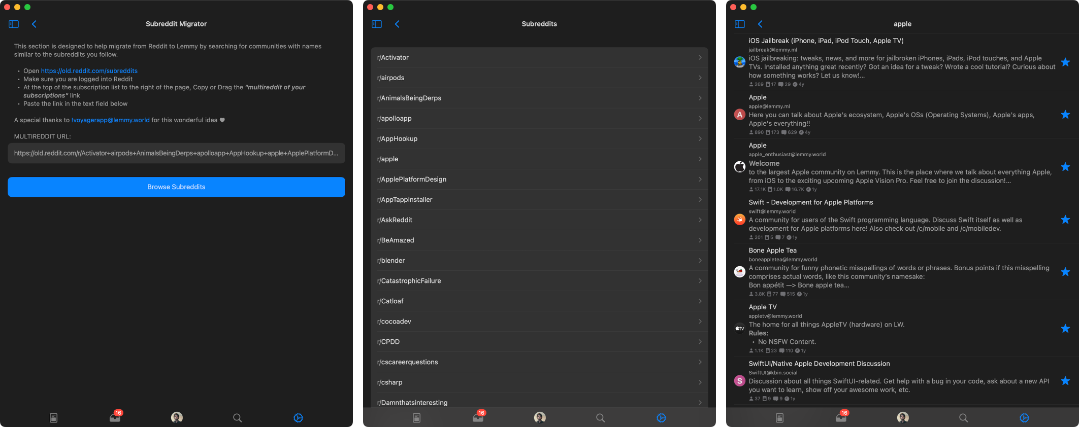
It’s not necessary to use old.reddit and I would recommend against it to not further confuse new average users that rely on mobile and rather keep it same as Voyager since their mobile interface is officially recognised and used by Lemmy itself.
There’s one bug I have reported to Voyager regarding multireddit, the u/user is converted to r/_u/user as well - here’s mine for testing:
https://www.reddit.com/r/AdobeZii+AnimalTextGifs+aniwave+apple+Art+AskLesbian+AskReddit+askscience+Avieshek+aww+BeAmazed+beetlejuicing+BharatiyansGoneWild+blackmagicfuckery+books+Bossfight+BrownPeopleThreads+BrownPeopleTwitter+carporn+clevercomebacks+comics+coolguides+dadjokes+Damnthatsinteresting+dankmemes+dataisbeautiful+Delta_Emulator+DesiFragranceAddicts+DesiNameNerds+DIY+Documentaries+EarthPorn+educationalgifs+environment+explainlikeimfive+fakehistoryporn+feghoot+FluxAI+food+foss+FREEMEDIAHECKYEAH+Futurology+gaming+Gamingcirclejerk+Guwahati+GenP+GetMotivated+gifs+headphones+HeySatanCalmDown+HighQualityGifs+HistoryPorn+HydroHomies+IAmA+india+interestingasfuck+InternetIsBeautiful+Jokes+Lemmy+lifehacks+LifeProTips+ListOfSubreddits+macapps+MacCrack+marvelmemes+maybemaybemaybe+MechanicalKeyboards+memes+mildlyinteresting+movies+Neverbrokeabone+nextfuckinglevel+NoStupidQuestions+nottheonion+oddlysatisfying+OldSchoolCool+onejob+OutOfTheLoop+pcgaming+pcmasterrace+PenmanshipPorn+PeterExplainsTheJoke+philosophy+photoshopbattles+pics+Piracy+piratediffusion+place+polls+PopularClub+PornhubComments+puns+Rainmeter+RBI+RedditAlternatives+RoastMe+science+ShaggyDogStories+shortcuts+sideloaded+space+StableDiffusion+SVWTCM+technicallythetruth+technology+ThatsInsane+TheRealJoke+tifu+Tinder+Unexpected+unstable_diffusion+UpliftingNews+vgb+wholesomememes+woahdude+WorkReform+WritingPrompts+YellowPeopleThreads+YellowPeopleTwitter+YouLube+YouShouldKnow+u_BGHK20+u_crinacle+u_GovSchwarzenegger+u_Katya_Clover+u_officialtobeymaguire+u_thisisbillgatesThe Arctic client also specifically fails to recognise c/community and u/user like in the lemmy.world desktop site.
I can change it to to reddit instead of old.reddit it seems either way it links to the exact same page. I can see how that could be confusing to a novice user.
As for
u/u_<user>in the link, I do filter those out so it will not show those in the results./c/and/u/were intentionally left unsupported due to this being a remnant prior to the new linking format of@<user>@<insatanc.xyz>and!<community>@<instance.xyz>. I can add support for these links though. I think for forward compatibility, I’ll have it automatically convert these links to the new format if one is typed.Instead of filtering them out completely try to utilise them like I have the same username on reddit and lemmy which should be the case for celebrities and famous figures as well like comic book artists.
I like that idea more, I’ll definitely add support for this. Thanks for the idea!
Always
(˵^◡^˵)
Great feedback. I’ve already implemented a way to disable swipe gestures which will be included in the next release. This is something I added the other day to improve the navigation on MacOS, but I’ll also include it in the iOS builds.
The double tap/long press for voting is a good idea, I’ll look into adding this as an option to the gesture settings.
Adding a subreddit migrator should be very easy to implement. I’ve already implemented the Lemmy Explorer api, which should streamline the migrator. I could probably come up with a working migrator tomorrow morning.
If you’re the developer of this app, then I would like to clearly state myself directly:
- Don’t get me wrong, side gestures should actually exist but it’s overly if not weirdly misused in Lemmy. Side Gestures should be strictly utilised to quickly enter (right swipe) and exit (left swipe) communities, posts, threads or menus including in settings by default instead of having to tap some corner of the screen. Side Gestures can also be used to switch between All-Hot-New in the homescreen where I prefer Voyager for thinking this through in the ‘Posts’ section.
- Double-Tap should be utilised to upvote, Long-Press to collapse, Haptic Touch to show the expanded menu items instead of accidentally triggering something random every time.
- ‘Save’ followed by ‘Share’ should have a dedicated button to the right under posts while the ‘voting’ and ‘comment’ button on the left need to become larger instead of having a case of ants vs elephants for the same function.
↑420 ↓69 <gap> 💬 <gap> ✓ ↻- The ••• menu for each post shouldn’t then display the same repeated options like the voting buttons for the third time after the above implementations and instead should focus on highlighting the essentials with focused minimalism like save media for example.
- Comment threads are really hard to follow on Lemmy, the colours are a nice touch that may even evolve to change with lighter shades but replies under main comments need to stay single like reddit with lines guiding them. Having the same card layout for comments, replies, subreplies… for the entire thread is a chaotic disaster. This goes same with posts where it’s difficult to gather where the screenshot ends and the caption begins especially when the attachments here are also weird.
- The display of user thumbnails would be really appreciated in the comments thread so not only it has some life but it’s easier to identify individual participants without being forced to read each meaningless to complex random usernames while scrolling.
- It’s been also observed that one can’t create or manage communities from the Lemmy client as opposed to Apollo which became moderator’s favourite Reddit client.
A personal observation: Default theme colour shouldn’t be sleep inducing bland blue but something warmer even if red to reddit’s orange. Skype, Facebook, Twitter to AIM all started with that particular shade of blue which didn’t have OLED darkmode back then; it’s advisable to not start with grey-blue combo to red-black by default for all age group going in this era.
Yes I am the developer of Arctic, thank you for taking the time to write out your thoughts. I’ll do my best to respond to all your feedback here.
- Swipe Gesture: when I mentioned a new feature to disable swipe gestures I was only referring to swipe actions on cells, eg. (upvote, downvote, reply, share, etc) swipe navigation is still enabled when disabling swipe actions. However with swipe actions enabled, you can still use swipe gestures to navigate the app, you just have to start your swipe at the edge of the screen just like navigation in the Mail app for instance. With that said, based on this feedback I added a new setting to enable full-screen navigation gestures, with this you can swipe left or right to go forward or back from anywhere on the screen. This is not a default iOS navigation gesture which is why I did not opt to include this from the start.
- Tap Gestures: This one I am unsure about, double tap to upvote makes sense, however Long Press, and Haptic Touch are the same thing on most devices now that Force Touch was removed from new devices, and there would be no good way to handle both on the same view. I’m not sure I understand what you mean by triggering something random every time? Do you mean swipe gestures are random?
- Post Footers: currently the information on the bottom left of the posts is just statistics label, its meant as an overview of the post contents, not as an interactive element, that is why the label is small, since interaction is not intended. As for the vote buttons to the right, I could definitely make the configurable like the swipe actions so you could configure their actions. I’d prefer not to use the left information label as buttons, but I can look into adding more customization to this footer view as a whole.
- The ••• menu: This is something I may be able to improve. I’ve opted to show repeated options like voting so the menu is consistent throughout the app. Users can change the swipe actions, and disable vote buttons, etc. so this menu may be the only place with those options left available, and I wanted that to be consistent in post feeds, open posts, comments, etc.
- Comment Threads: This is something that definitely has room for improvement. I am working on adding profile pictures which should help improve following conversations. I do not want to differentiate between comments, replies, subreplies, etc. These are all just comments whether it is a reply to the post or a parent comment. I do plan to add support for continuous lines to the left to make it easier to follow comment depth, However the current layout is basically the standard as far as comment feeds are handled in most other apps I’ve used with comment chains.
- Comment Profile Pictures: I mentioned this above, but this is something I am working on adding, I’ll hopefully have this included in the next update.
- Creating and Managing Communities: This is a feature already, Though I may need to improve its visibility. For editing a community you moderate, you can open the ••• menu at the top of the screen when viewing a community feed and select Edit Community. Here you can edit the community metadata and settings. For managing user reports, you can open the same menu and open the Mod Zone (only available if you moderate at least one community) which is available in the profile tab, or the subscriptions list view. For creating communities, currently this is only available in the profile tab under the ••• menu, but I will also be adding this to the subscriptions feed for better visibility.
- Default Tint Color: This one is something that won’t be changing. Arctic is modeled to behave and appear like a system app on iOS, most system apps use a default tint color of blue. Additionally, Arctic’s logo is primarily blue and this fits with Arctic’s branding. Blue is also a calming color with great contrast and legibility with both light and dark backgrounds. In designing Arctic, my primary influences were Apollo, and the system Mail app, both of which use the default system blue for the tint color. However, if you do not care for the default tint, you can always change it in Arctic’s Appearance settings. I am also in the process of adding full theming support for Arctic so you can customize the color scheme of basically every element in the app, and save multiple themes.
All of this is open to discussion, I’m always happy to add new features and improve Arctic. On that note, I did finish up the Reddit Migrator yesterday. The new migrator works almost exactly the same as the migrator in Voyager, It was done very well there and I did not see much room for improvement.
Thank you for all the feedback, it is always welcome!
[edit] I just finished number 6, comments will now display user avatar pictures. Users can enable or disable this feature in settings
I am glad and nice to meet you, after witnessing your dedication first hand I would also like to try my part in bringing more exposure to your client here on forward and I hope my feedback can also bring forth the same support from others. If it’s preferable, we can directly interact in DMs to keep tab of everything at one place and would be happy to contribute further.
- Only exiting an app itself is not default on iOS with side swipe gestures but for navigating through different layers of menu has been standard for ages including the Reddit app itself. The swipe actions on cells is something more seen on email clients like Spark or Mail itself if not Gmail but there’s a huge difference between public comment threads and your inbox, this is something more suitable for messages or notifications if implemented outside. I would rather you use right swipe gesture on notifications and messages only to mark them as unread and leave comments, posts and communities alone where left swipe gesture universally exits to previous menu.
- How about this? Single Tap to collapse comments, Double Tap to Upvote and Haptic Touch for Menu Items. I was only introducing the idea to see past through existing implementation of repeated taps hidden under menu items where you may even implement triple taps or use the same haptic touch to open the menu and then select the menu option at one go without lifting your thumb, Threads and Instagram app have some beautiful ideas recently like the carousel for multiple images. Am sure not being the only one here (I have read quite a thread of user frustrations on support forums regarding this) but the default behaviour of swipe gestures lead to random upvote-downvote, archive to even blocks - this is the numero uno 1 complaint of all Lemmy users and am myself only saved by drawer style option offered by Arctic where otherwise I would’ve left long time ago. However, it still adds friction if not weird on long comments like this one as opposed to email notifications which only draw a summary like any notification. Voyager only sparingly addressed this by adding a toggle to disable side gestures as a whole at a later stage but without an alternative at place like the double tap I have suggested that exists from Reddit to Instagram. If your app is the one that properly addresses the feedback I bring forth to you which are the the no. 1 complaints of users transitioning to Lemmy then this can easily become the no. 1 client to the point of setting how things (like default behaviour) should be at Lemmy after Voyager.
- There’s no use in configuring the ones on the right if the left ones are a non-interactive element, can’t they made to be interactive? I don’t mind if the voting buttons are on the right but my point was to integrate both interactive and non-interactive element into one and open up space to lessen the reliance on ••• for common usage.\
✓ ↻ <gap> 💬 <gap> ↑420 ↓69- That’s why the implementation of earlier is important as in a step-by-step process, there’s no third-step without second-step in place.
- Simply make it easier to differentiate posts from the comments, the captions and attachments in the posts, and the parent comment from another parent comment so it isn’t confusing with replies if two people are arguing and am only interested in reading about the topic on hand for example.
- Thank you.
- I am actually aware where the edit option for communities are but unlike the desktop site for Lemmy.World, if your description has more than three lines on the viewable pane making use of the 5000 word limit with community rules, headers, bullet numbering etc then you’d understand what am mentioning here. Simply try to put and then edit your previous reply am responding upon in a community description through your client.
- I will not argue on this and rather suggest exploring more modern hues of blue like your app icon and match the comment theme with app colour automatically instead of still staying on grey at least.
I’m beginning to think this app is abandoned, man. I don’t expect any features to be added. TestFlight version hasn’t been updated in 2 and a half months.
It’s not dead. I’ve been very busy and have not had the time to work on it recently. I’ve started working on the next update, and I nearly have it ready for the next TestFlight release. I have a dozen or so bugs patched and a few new features done. I’m also hoping to finish up theming support before the next release.
Next month I should have the time to finish up, and release the MacOS build I’ve been working on, along with improved iPad support.
Things should start moving here again. I’m hoping to get back to weekly updates here soon.
I like the smoothness and animations from being built natively but these tiny-tiny annoyances everywhere are also irritating at the same time like with swipe gestures mentioned above that can be double-tap and long press instead or the notifications for example doesn’t reset nor receive them at real time and so on…
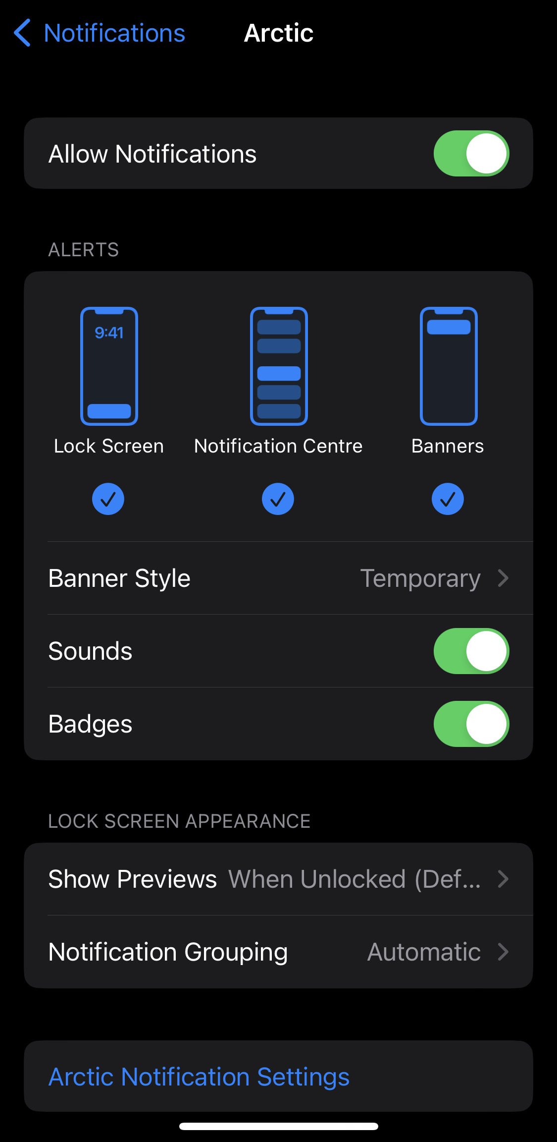
I keep forgetting to enable clearing notifications when reading them in app. I added this feature, but had it disabled for testing. Thank you for reminding me.
As for real-time notification, this is just not possible yet due to API limitations. If they add support for web hooks in the future, then I will add real-time notifications. But currently the only way to get notifications is to request them from the instance. Im already fetching notifications once a minute for each account with notifications enabled. This translates to a lot of network traffic for instances, and I do not want to increase that beyond what it is currently.
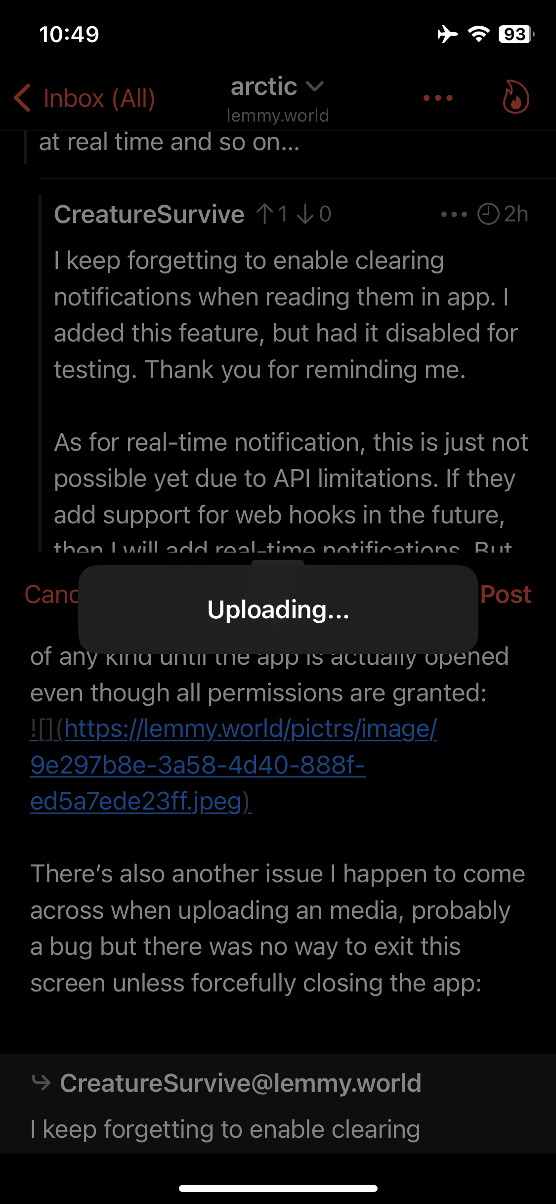
What I really meant is push notifications, like there are no banners, badges or alerts of any kind until the app is actually opened even though all permissions are granted:
There’s also another issue I happen to come across when uploading a media, probably another bug but there was no way to exit this screen unless forcefully closing the app:
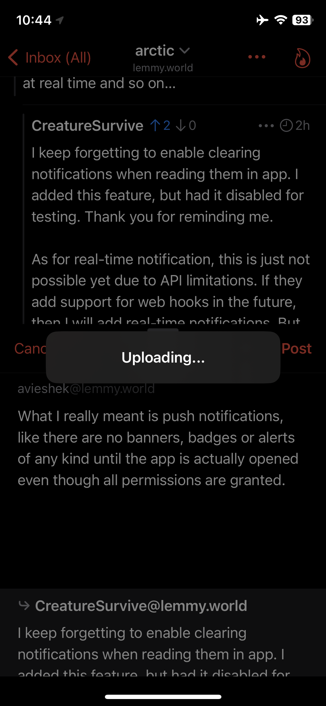 Please change the interface that allows to dismiss with a cancel button so one doesn’t have to start all over again if they’re writing a comment.
Looks like this happens when permission to select more images is about to be granted but it skips to upload instead for the first time per new image:
-
This is a strange one, I have not received any reports of this behavior until now. I did restart the notification server today to see if that may resolve this issue, but I will be taking larger look into this during the week to see if I can’t find what might be causing this. In the meantime, could you try disabling and re-enabling the notifications in arctic to see if that resolves the issue?
-
I will definitely add an option to cancel media uploads, this was a poor design choice on my part, I should have included a cancel feature from the start.
-
You are absolutely right, this has to do with granting access to new images, I managed to resolve this for the next update. Limited access makes things a little more complicated than it should be. Now with limited access, Arctic will ask you to grant access to new photos before asking to choose new photos to upload. This can be configured in Arctics settings to ask about granting access before each upload, or only doing so once per app session.
- I reinstalled the app fresh even and now on your TestFlight but couldn’t really figure out myself here. However, I tried going to accounts > profile and manually enable the push notification toggle which led to a spam of sound notifications with lockscreen being lit up every five seconds for the same notification until being turned off, the app crashed on the TestFlight version when hitting the Report Issue button under ⚙️ and continues to be the case even now.
- No disagreements here but I have noticed bullet lists can break inside Arctic app when using paragraph spacing. It’s fine in lemmy.world site but on the reddit iOS client for example one can hit
return(enter) while pressing the shift button to introduce paragraph breaks inside the bullets and numbering just like the desktop site. - I applaud your understanding on this issue but if am not mistaking this wrong then instead of having to toggle within the settings layer again, just integrate having to choose & allow together when attaching a new image unless all permission is granted from iOS Settings like in other apps. One thing I would like to ask is will it be possible to attach media outside of Photos app (as from anywhere - Files app for example) like in macOS? Also, for media attachments… can they be shown exactly where it’s mentioned instead of collecting in the bottom? Not sure why caption is necessary for each upload but the images can be above those captions that are forced to fill anyway so it maintains the flow of relevance.
- This is odd. I’ll have to look into this. Notifications have been working fine for the last year, but I received 2 reports about this issue this week. I’ll try and track this down tonight.
- I made some improvements to the bullet lists the other day, they will now have spacing between items in the list. For multiple paragraphs in list items, I’ll have to look into this, because you are right that they do not render correctly. All the text rendering in Arctic is completely custom, so it’s no surprise that missed some features. I will look into this though and try to find a solution.
- It seems that iOS changed some things with the image picker, and it’s no longer necessary to ask for photos access permission when selecting a photo. I’m going to look into this and see if I can’t simplify things for limited access. It’s definitely not ideal to have to select photos twice.
- As for displaying photos in-line, this is something that I’ve wanted to do for a while now, as currently any photos are just appended below the comment text. Like I said, the text rendering in Arctic is completely custom and this is a bit of a tricky task even though it may seem simple. For instance Apollo never managed to implement this either. IOS does support showing images in text views, though this would not work for gifs or videos due to limitations. I finally managed to get something working for this yesterday, and it’s now possible to display images or videos in-line. I do not have this fully implemented yet, as it does cause some text rendering issues that I’ll need to fix. I should definitely have this fully working here soon though. Also, with this new feature I should be able to improve support for spoilers and markdown tables using the same technique.
Regarding Numbered List: While making a response, the numbering stays right during editing mode - something to take note of that it can be fixed as I would be looking forward to subnumbered list like 1.1 → 1.2 next, instead of just 1 → 2
Here’s reddit markdown wiki which is a good reference to bookmark for across all internet to follow in a synchronised manner.
↳ Personally, I would restrict italics to only_italics_and bold to*bold*One thing however I don’t understand is the nature of spoiler here as opposed to anywhere else including reddit itself, the one on Lemmy is more like collapsible menu items than a spoiler. If you’re fixing the spoiler back to normal then I would request to rename the current spoiler system to something else which is good for sidebar rules but not really as a spoiler itself in comments.
!spoiler!<
::: menu Title Text :::
Looking forward to the changes. ✌︎
^Also, looks like link previews have the same problem as images.^
-

