- cross-posted to:
- gnome@discuss.tchncs.de
- cross-posted to:
- gnome@discuss.tchncs.de
I love how much attention Flathub is putting into app metadata guidelines.
I see a lot of problems when looking for software in software centres. App icons and app screenshots that make the software appear like 2005 abandonware, gaudy non-standard theming in screenshots on app listings, incomplete descriptions, stupidly long app names that read like a whole sentence, etc.
In fairness, you go onto the Windows store and it’s the exact same. But my god, the Windows store is awful, so that’s not what we should have our eyes on.
I dislike Apple and don’t intend to own any of their products, but one thing they do well is forcing high quality listings on their app stores.
Flathub is sensibly trying to emulate that (though with gentle nudges as opposed to enforced terms), and I’m grateful they’re doing that work, because it’s important.
I dislike Apple and don’t intend to own any of their products, but one thing they do well is forcing high quality listings on their app stores.
Do they? Whenever I search for something I don’t already know on the App Store on my iPad it takes a sharp downturn as soon as you’re part the first few apps. It’s like someone put together a collection of scamware on purpose.
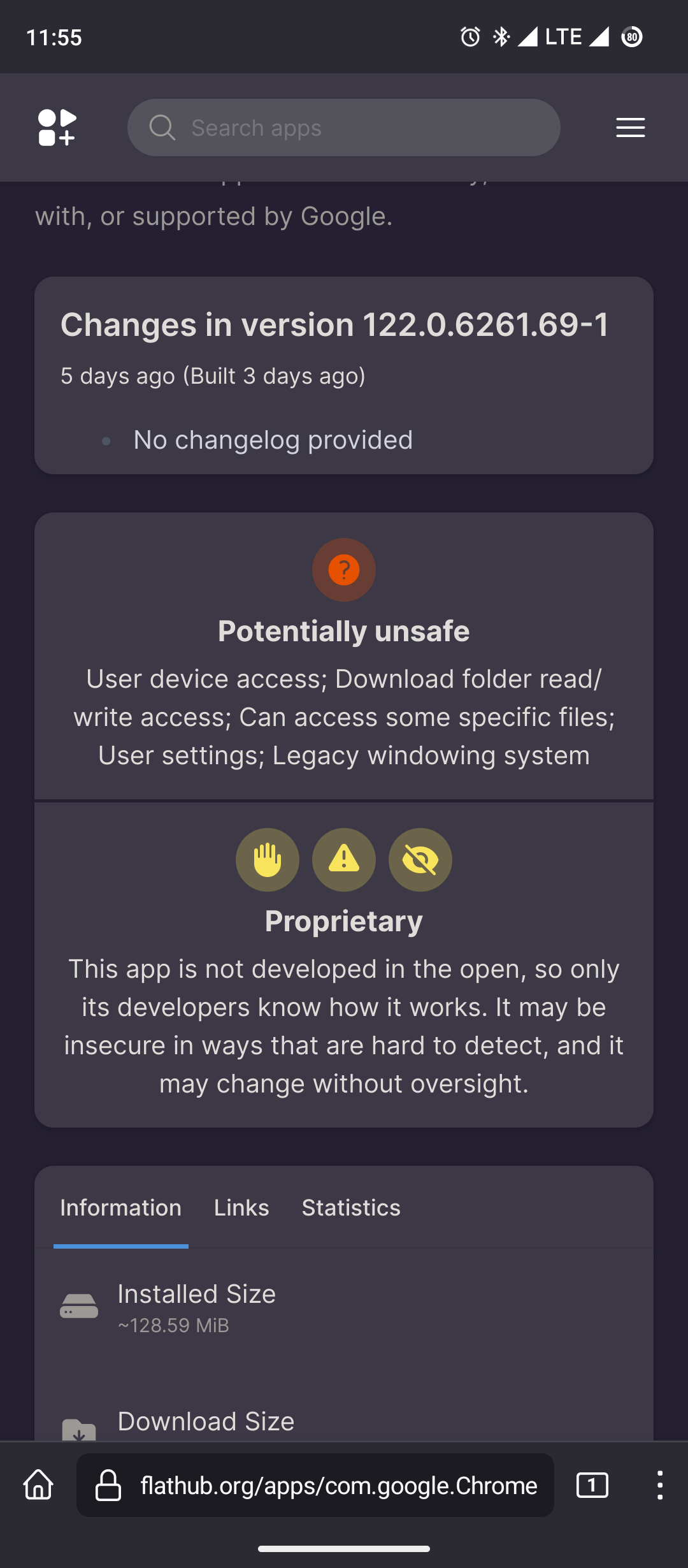
Interesting, I do wish that flathub was more like F-droid. F-droid lists anti features and allows you to easily hide software that has anti features you don’t like.
Flathub does provide
 warning like system.
I don’t think we can filter using these though
Anti features?
https://f-droid.org/docs/Anti-Features/
Features that harm the user. Examples include telemetry and non-free libraries.
Oh neat!
Features that are not so great: “This app redirects to data gathering services” stuff like that


