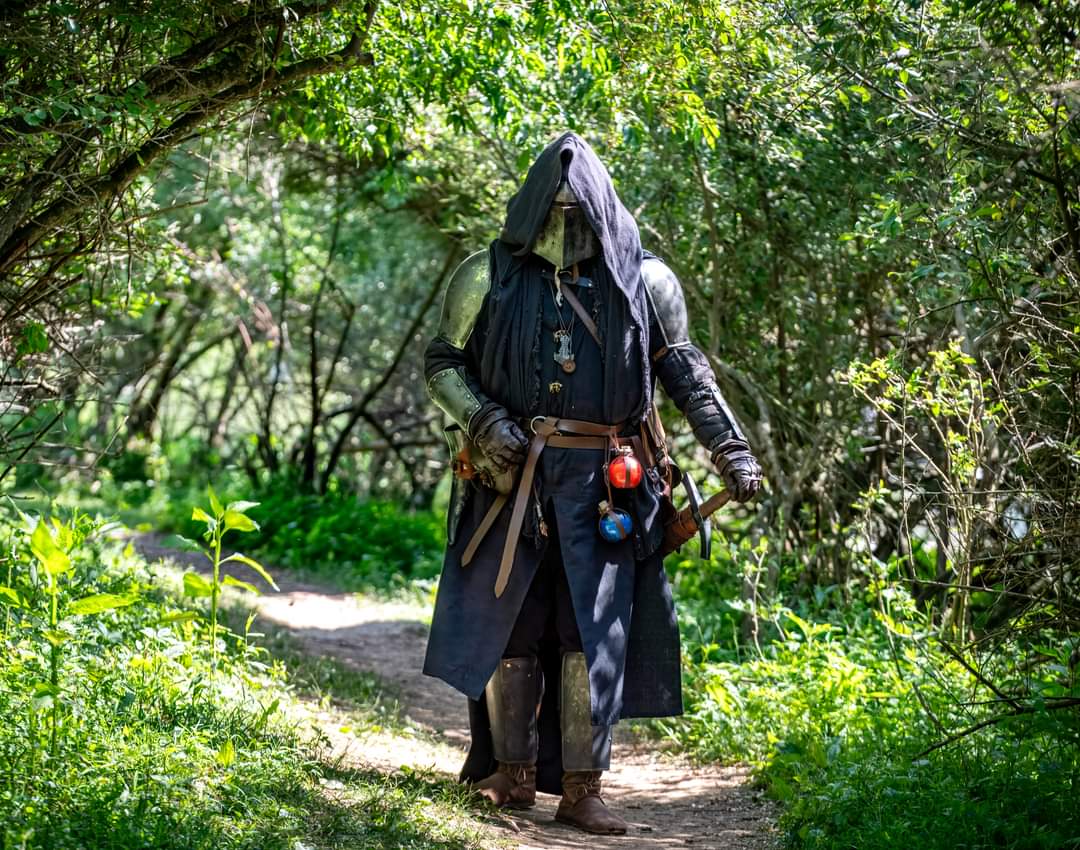
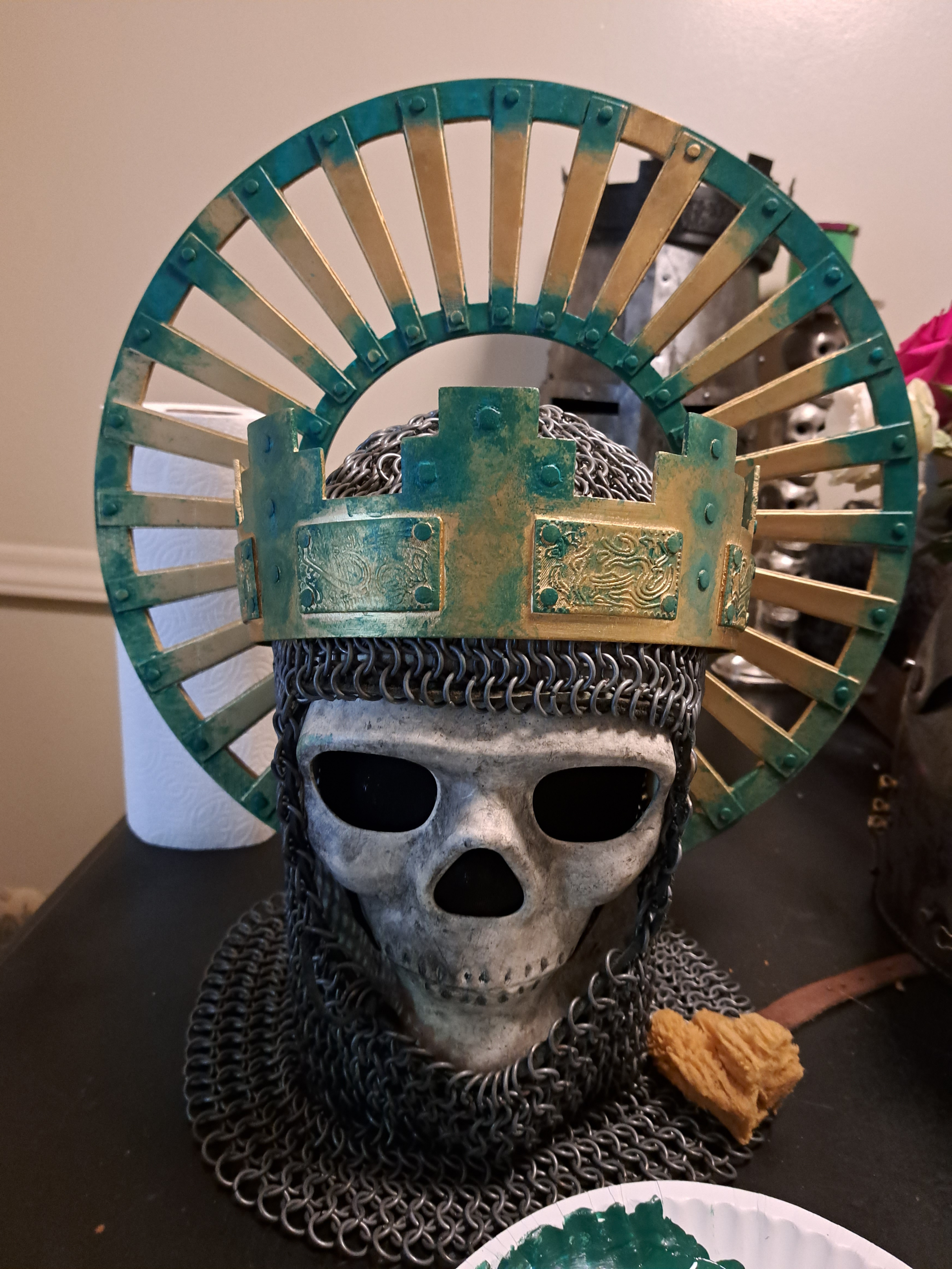
Looks much better.
Top is after, bottom is before, right?
Absolutely not. You’re kidding right?
So you just hit it with silver spray paint then? Top one looks nice
I gave it a base coat of textured paint, used acrylics and different weathering techniques to give it more texture and depth. Added a rust effect as well. The rust color is a little off from how it normally looks.
Might just be the fact it’s plastic.
Used the same techniques on this one as my other helmets and projects.
https://imgur.com/gallery/FgjXBOe
I like the grimdark aesthetic so that’s normally what I go for.
You seem to be good at this, it has to be the plastic.
Yeah. Might need to add more “grime” to it.
These are plastic and they came out great.
Hmm
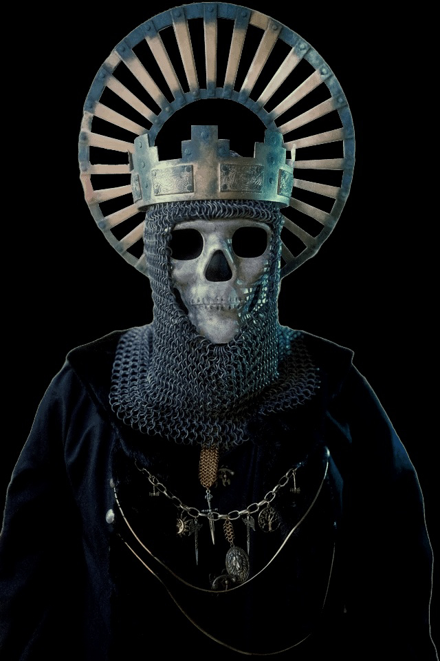
OH MY GOD YOU’RE THAT GUY 👏🏻👏🏻👏🏻
Yuppers. Sure am.
deleted by creator
I disagree. Top looks tacky and costumey. I like the bottom more
I will agree it needs a touch more work tho. Needs a bit more “grime” and dirt. Darken up the low spots a bit more.
That’s what threw me off at first, the bottom is very nice. I think some grime and darkness in places, maybe even corrosion would give it some life. It looks too “new” you know? Almost like a 3d model. I think if you could make the raised portions more defined (with shadows via airbrushing, doesn’t need to be a physical change) it would make the helmet more defined. If you haven’t seen that one Mythbuster detail models, I highly recommend giving Adam Savage’s YouTube channel a watch!
That’s actually where I learned some of my process as well as my friend who showed me how to do this.
Honestly looking at it in person it looks so much better than this image.
I am definitely going to darken the low spots to make the relief show up better.
That’s what threw me off at first, the bottom is very nice. I think some grime and darkness in places, maybe even corrosion would give it some life. It looks too “new” you know? Almost like a 3d model. I think if you could make the raised portions more defined (with shadows via airbrushing, doesn’t need to be a physical change) it would make the helmet more defined. If you haven’t seen that one Mythbuster detail models, I highly recommend giving Adam Savage’s YouTube channel a watch!
That’s what threw me off at first, the bottom is very nice. I think some grime and darkness in places, maybe even corrosion would give it some life. It looks too “new” you know? Almost like a 3d model. I think if you could make the raised portions more defined (with shadows via airbrushing, doesn’t need to be a physical change) it would make the helmet more defined. If you haven’t seen that one Mythbuster detail models, I highly recommend giving Adam Savage’s YouTube channel a watch!
… I prefer the top one better, more interesting to look at. I do like what you did with your other helmets though, your great helm looks sick.
Thanks! Can’t wait until I can paint my new helmet too. Gotta wait until I am done with the last few modifications though.

