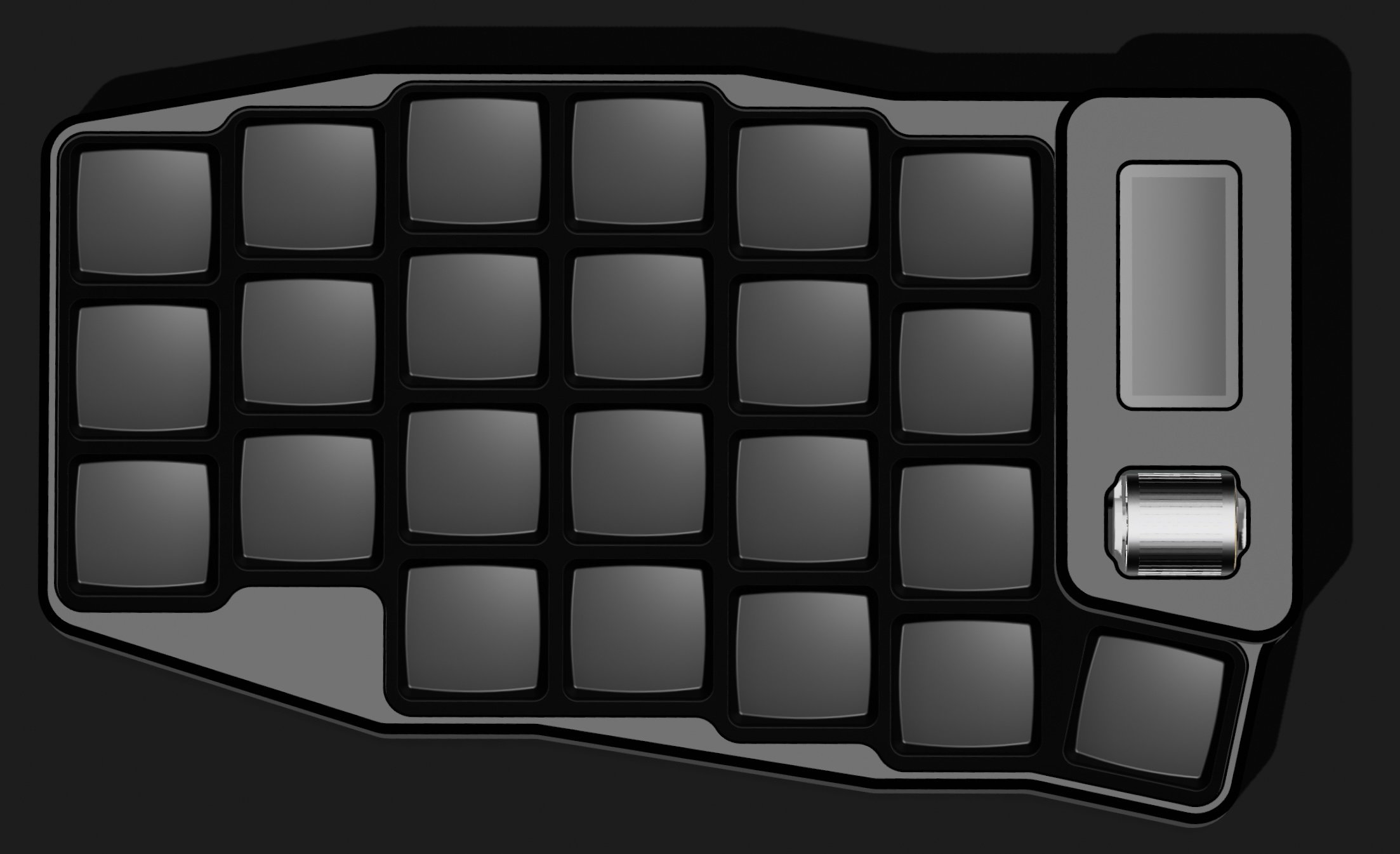
I’ve made the 0.1 design available to the public now.
Ive been using it for a few weeks myself and its quite nice to use, particularly with the aluminium chassis (the GitHub repo has FDM and CNC designs).
In any case, for those curious the GitHub is here: https://github.com/MickiusMousius/RolioKeyboard
I am working on the V1.0 model, PCB’s should arrive in a few days. I think the V1.0 release should be good enough for others to make. The current model is nice, but there are a lot of improvements in the pipeline particularly regarding aesthetics.
V1.0 sample below:


Thanks.
I took some hand measurements and this is what it came out with:
I didn’t add the splay, I started to add it, but decided that in practical terms it likely doesn’t make much difference but it made things quite unwieldy looking.
In practice I’ve found the pinky column needs to drop by about 3-4mm which is a change I have in the newest iteration.
Be careful that, with this tool, you are naturally reproducing the habits you already have. I’ve seen this tool used by Ben Vallack (https://www.youtube.com/watch?v=IoBjVhJY4io&list=PLCZYyvXAdQpsEWfa6OEBOhHn48SWgneoD) and you can see, in his progression, that at first he was for no pinky stagger, and now he is for aggressive pinky stagger.
Ah, yes, I did suspect this was muscle memory at work.
The stagger is very similar to that of a Sofle though, and, inline with goals it should hopefully be usable by other newcomers.
Also wanted to chime in that I appreciate a more conservative pinky drop, as a compromise between ergonomics and keeping it useable while gaming with minimal rebinding (keeping the vertical stagger between the a and s keys in the usual wasd navigation cluster within a reasonable threshold since it’d be used with the ring finger instead of the pinky in those context)
I feel this is also inline with the apparent (I’m making some loose assumptions here) goals of being a little more newcomer friendly, along with the fact that it has a bit more thumb keys than what many consider optimal for ergonomics and other details. It really feels like the intermediate step between the typical entry point split ergo boards like the Lily, Iris, or Sofle and the more optimal ergo boards.
Pushing those additional eronomic quality of life tweaks may improve the board, but it also brings the board much closer in target demographic to existing boards like Hillside or Cantor/Piantor for example, and arguably makes this board less uniquely appealing.
I hope I don’t come off too strong with my opinions here; The design middle grounds picked in this board so far really resonates with me in a way few others have that I can’t help but get excited. 😁
on a different note entirely: Good callout/reminder on the pitfalls of over-relying on that tool in a way that reinforces existing habit that may not always be optimal.
Thanks. The loose assumptions are dead on.
Funnily enough after implementing the “math mode” I realised I’d made a gaming half board.
If you use szxc instead of wasd in math mode you have all your numbers still. The left side has a USB mode so you can avoid lag that come from BT (though that hasn’t been an issue for me). SZXC could easily be remapped to WASD on the firmware.
It got me to thinking whether I should tinker with a games mode…. But I don’t play enough PC games to have the right perspective for that. I suspect it’d be a very poor fit and more the kind of thing best left to people that like to make their own stuff to update the keymap who do a bit more of that than me.