Edit: nvm, I changed something in settings, it was user error. Pls disregard
Hi Thunder devs, I have an accessibility issue to report regarding the special styling for original poster and mod names (changed with the last major release). I haven’t checked against WCAG, but I’m pretty sure they don’t meet color contrast standards; it’s pretty hard to read the grey text, especially over the ‘mod’ orange.
Otherwise, no complaints. I really dig Thunder, I chose it as my daily driver after months of testing alongside Voyager, Eternity, and Jerboa. It just feels more responsive and intuitive, and the customization options are quite good. Nice work!
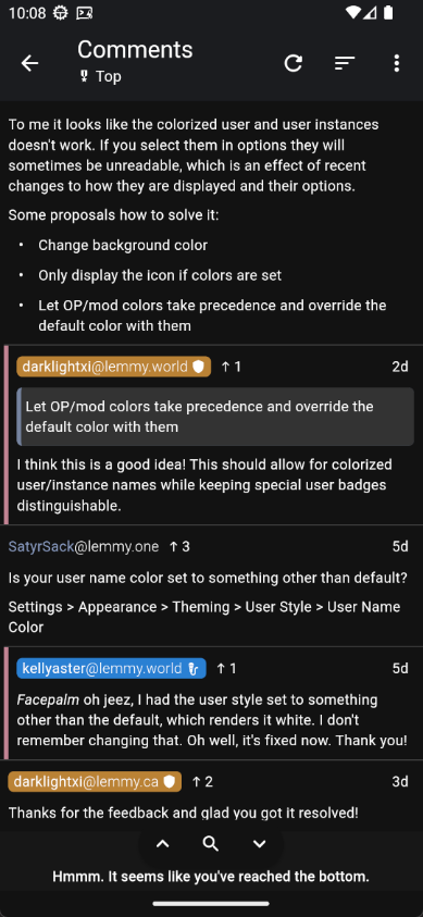
Is your user name color set to something other than default?
Settings > Appearance > Theming > User Style > User Name Color
Facepalm oh jeez, I had the user style set to something other than the default, which renders it white. I don’t remember changing that. Oh well, it’s fixed now. Thank you!
I had the same issue as OP.
Even if the default color works, I still think there is an issue somewhere here that should be addressed.
To me it looks like the colorized user and user instances doesn’t work. If you select them in options they will sometimes be unreadable, which is an effect of recent changes to how they are displayed and their options.
Some proposals how to solve it:
- Change background color
- Only display the icon if colors are set
- Let OP/mod colors take precedence and override the default color with them
Let OP/mod colors take precedence and override the default color with them
I think this is a good idea! This should allow for colorized user/instance names while keeping special user badges distinguishable.
Let OP/mod colors take precedence and override the default color with them
I think this is a good idea! This should allow for colorized user/instance names while keeping special user badges distinguishable.
Just chiming in here to say that this has already been implemented in the current prerelease and should be available in the upcoming general release!

Thanks for the feedback and glad you got it resolved!


