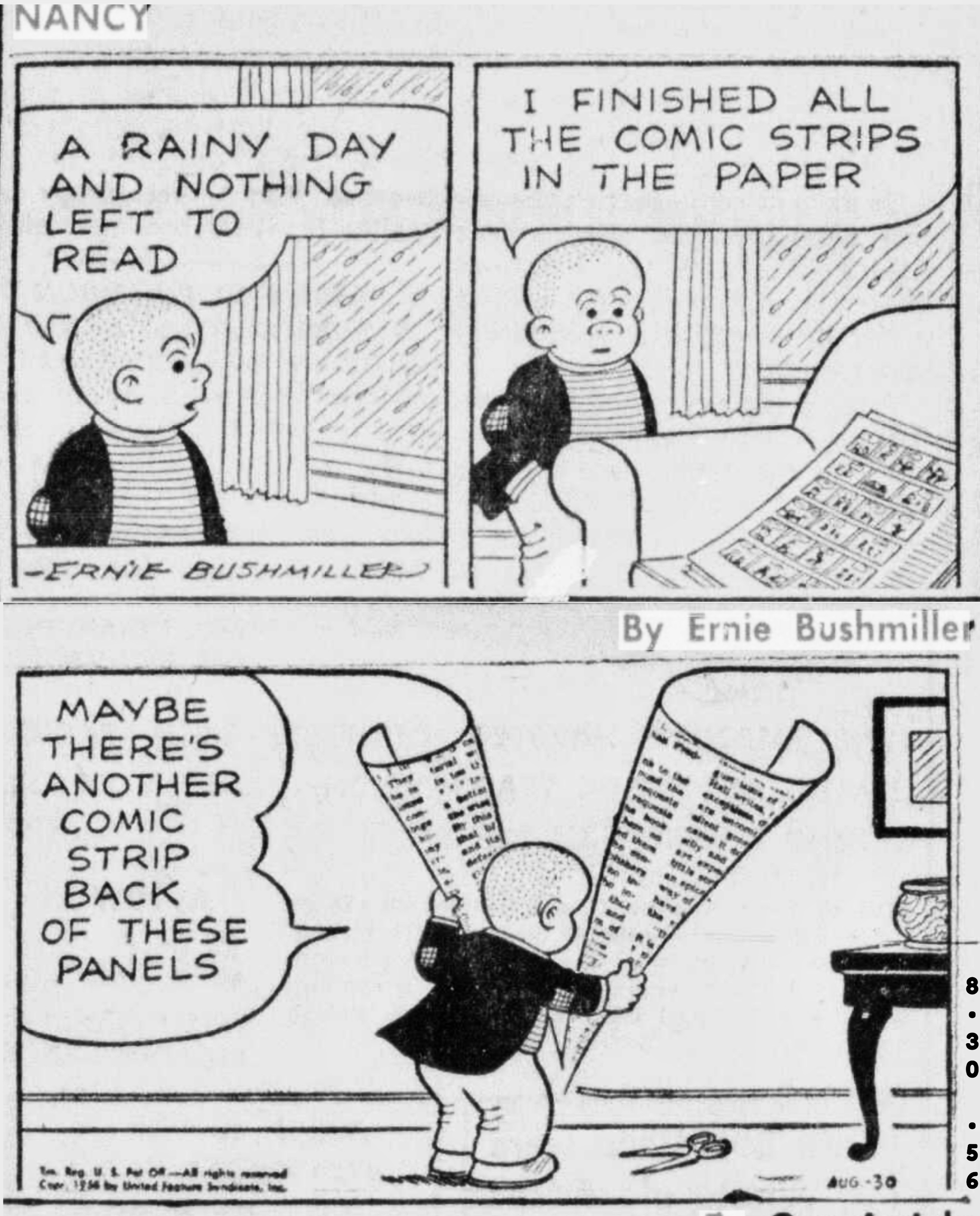
I hope this is allowed by the mods since it isn’t a comic strip itself, just a panel from one, but it shows an artistic expert that you wouldn’t think of as being one at work.
Although Nancy is not thought of highly anymore, and was even mostly a cheap gag strip when he was drawing it, Bushmiller had a real eye for the absurd which has been forgotten. He broke the fourth wall in a way that was not done again for a long time.

But Bushmiller was also an accomplished artist and he understood concepts like the golden ratio really well. I saw this elsewhere and thought it would be worth sharing because it’s the sort of thing people don’t really think about when looking at a comic strip.
If you’re interested in Bushmiller, Zippy the Pinhead artist Bill Griffith made a graphic novel biography of his life.
https://www.amazon.com/Three-Rocks-Story-Bushmiller-Created/dp/1419745905
Those are dope. I think it’s funny that the top comic has shadows always under the character. It exposes something about the drawing style the artist uses. It’s like the character is the origin of the rest of the scene: lights, setting, etc. I’m sure they just didn’t think too hard about it but it’s interesting.
Edit’: actually, technically, it looks like the lamp would cast that shadow. So it kind of makes sense lol
This was super cool thanks for sharing.
Anything can happen in a roll hack


