Slightly bigger so they wouldn’t have to slaughter the layout to get arrow keys in there and I would be interested.
It already pisses me off that so many notebook keyboards deviate from the IBM “standard”. I don’t need an external keyboard to fuck with my muscle memory.
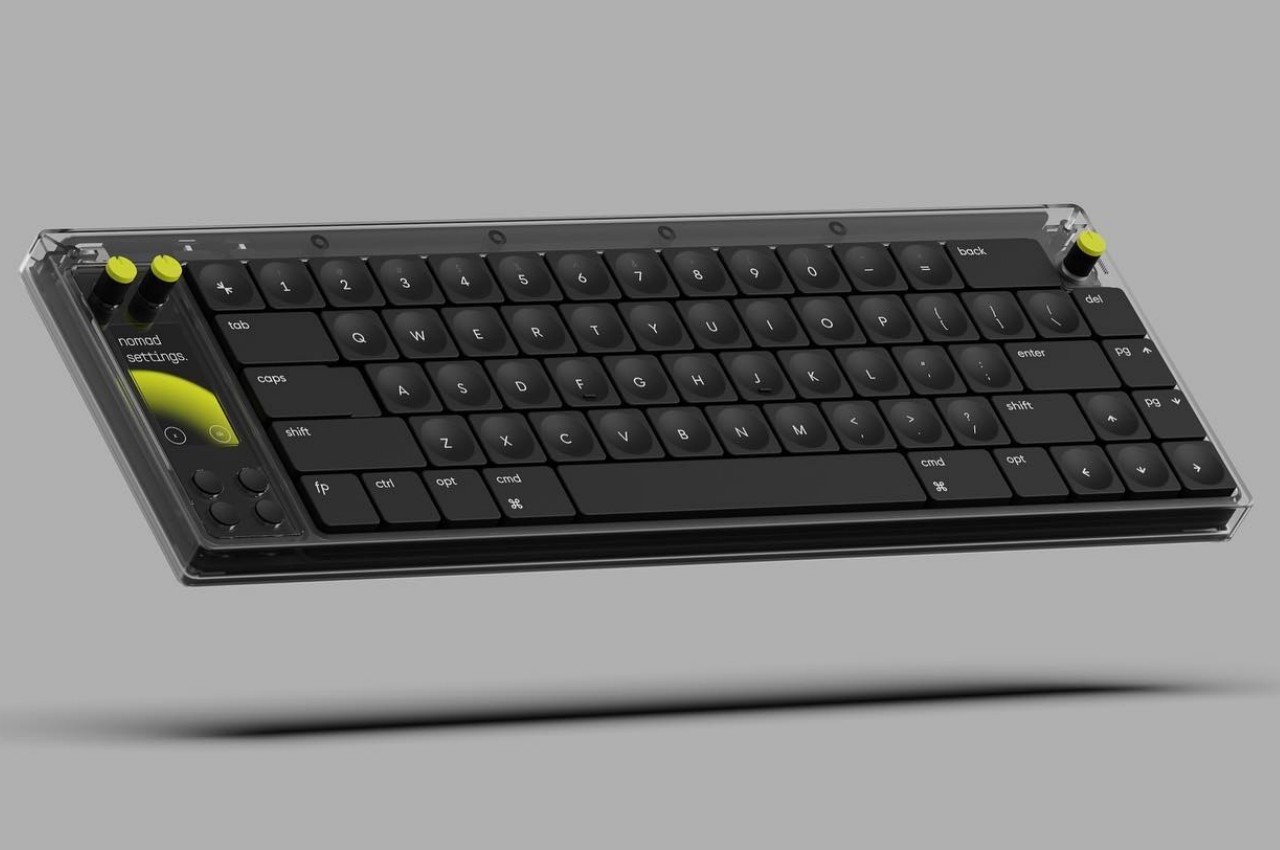
Hmm, what do you mean? To me it looks like a normal 65% layout
Sure. And I haven’t seen a single one I like, so far. Compact tenkeyless are my threshold. I like the knobs and display (and the general customizability) of this WorkLouder keyboard, otherwise. But not the general layout.
Compact TKL aka 70% uh? Such a great layout. Make sure you don’t miss out on the Cycle7. The best value boards released in the last 3 years imho
If you’re talking about the tucked-in arrow keys, you’d be surprised how quickly you adapt. I’ve gotten so used to it that the more spaced-out configuration feels unnatural to me at this point. I don’t think I’m alone, as I’m seeing this layout more and more.
Give it a try (maybe not on something as expensive as this is!) Maybe you’ll like it and it’ll open up more options for you.
Dammit, now I am intrigued…
I bet you’re angry at Corne and othe splits as well…
They have some other options on their site but I don’t think any of that helps your point.
Pretty cool. I won’t buy a first gen product like this (personal policy to let early adopters work out the bugs first), but it’s great to see more wireless keyboards with more features.
Interesting, but what is with those flat and mashed together keys? I mean i get it, they’re going for the Magic™ aesthetic and all, but it’s like they only cared about fixing the mushy key feeling of Apple keyboards and ignoring the other glaring issues. But there’s a screen and some dials so, yay?
Some people prefer the ergonomics of low profile and tight spacing. The thinking is that it results in less finger movement, and thus less wear and tear on your joints, over the 40+ year course of using a computer for work.


